
Boardgame Design: Tales of the Arabian Nights
May 23
Board & Miniatures Games Tales of the Arabian Nights 13 Comments
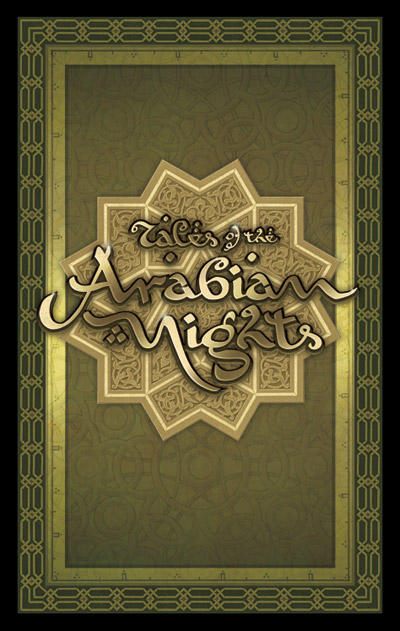
Card front and logo
[click image to enlarge]
My next major boardgame design project has been the remake of the 80’s classic part-boardgame, part-roleplaying game, Tales of the Arabian Nights, by Eric Goldberg, to be published by Z-Man Games. There have been two versions of this game–one in English in 1985, and one in German in 2000.
I pushed to get this job because I thought the rich possibilities of the theme had not yet been explored in gaming graphic design. The Arabian Nights is an unique and exciting melieu, but too often it gets a very Westernised fantasy treatment. One of my personal goals was to create artwork that reflected the exotic nature of the Arabian Nights. So the motifs are sourced from Islamic decoration, embellished with glittering metals and colourful jewels. Another big influence were the wonderful ‘Golden Age’ illustrations of such masters as Arthur Rackham, Edmund Dulac and René Bull.
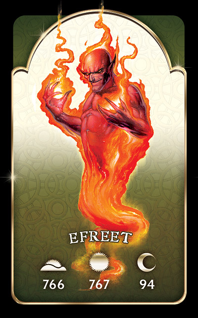
Encounter card
[click image to enlarge]
It was the chapter headings from René Bull’s 1912 edition of the Arabian Nights that inspired the game logo. Using that hand-drawn font as a basis, I reworked the letter forms to arrive at something a bit more readable but still evocative of curvilinear Arabic letterforms.
The mechanic that makes Tales of the Arabian Nights quite different from your usual game is the story–as the players adventure throughout the known world they refer to numbered paragraphs in a Book of Tales that tell an exciting interactive tale–a bit like the old Choose Your Own Adventure books. The players’ reactions to the encounters influence and expand the story.
The game has a wealth of cards, many of which refer to these numbered paragraphs. In the Efreet encounter shown, the paragraph referred to depends on the time of day the encounter occurs, either morning, noon or night (or more prosaically, the further along the game has advanced).
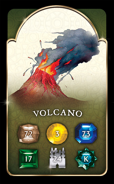
Location encounter card
[click image to enlarge]
On location encounter cards, the paragraph number depends on the terrain in which the encounter takes place. One thing I got rid of from the old editions were the fiddly icons that denoted the different locations on the board. Instead, I used coloured gems (also different shapes to assist colourblind players). These correspond to paragraph numbers on the encounter cards. It’s also immediately obvious which type of terrain the gem is in from the colors and illustrative terrain on the board.
City encounter cards refer to specific cities on the board and feature a picture of the location and a random encounter table. There are also many other cards for various player statuses such as ‘love struck’, ‘pursued’ or ‘under geas’.
The card illustrations were done by the talented Dan Harding, whose bold, evocative work dominates the design. Nice work Dan.
The map, of course, was the main design challenge. In previous incarnations the map was painted in a very conservative fashion–green forests, blue seas etc. This new map, a small detail of which is shown, is heavily influenced by ancient cartography, the fascinating subject of several books I own. Hence the parchment look, the more subtle colouring, and the period-accurate style. Instead of little illustrations I have used silhouettes of buildings that match the architectural styles of the cultures, which contrast nicely with the old map look.
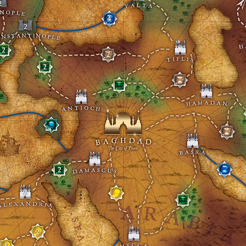
Map detail
[click image to enlarge]
There’s still a bit more work to do on this project–laying out a 256+ page Book of Tales for example–but I’m convinced it will be worth the wait. Because this game is such a storytelling, semi-roleplaying one, the object has been to create designs that transport the players to another world, stimulate their imaginations, and immerse them in the exotic, different world of the Arabian Nights. With the aid of research into old Arabian Nights editions, Islamic decoration and ancient cartography, I hope to achieve that goal.
More previews soon!
May 25, 2008 @ 18:37:57
Looks great! Can’t wait for it to arrive.
May 25, 2008 @ 23:56:37
Looks great – great work! A 256 page book??? You’ve got to be kidding! That’s a massive job!
May 26, 2008 @ 07:04:50
I’m so happy you’re doing the graphic design for this. It’s a great game, and I’d love to get it in an updated look. It looks extremely beautiful so far.
P.S.: Looks like you got a little spam problem with the comments here.
May 26, 2008 @ 07:55:44
This is just gorgeous! I was already very interested in the reprint after reading about the game on BGG, and after seeing the design, it’s definitely on my shopping list.
I’ll buy a great game even with poor design or artwork, within limits, but the visual style does so much to enhance the experience of playing the game. And it also makes it easier for me to justify spending the bucks on it 😉
I’ve been following Mike Doyle’s blog for a while, but I wasn’t aware of yours. I’m subscribed now…
May 26, 2008 @ 11:12:19
Nice work coloring in the lines 🙂 Looks good!
May 26, 2008 @ 11:20:54
Great job! The design looks fantastic. This is a game I am really looking forward to, and your design is amazing!
Cheers,
Giles.
May 27, 2008 @ 17:20:46
Nice Job Pete! Up to your usual exacting standards. Look forward to seeing the final product. Hope you are getting good recompense for this as well?
May 29, 2008 @ 19:36:35
It’s hard to think of how this description of the new-and-not-improved artwork could have been more pompous and self-congratulatory. Too bad your product doesn’t match up to your own view, and you give no indication of being open to legitimate criticism of your flaws.
May 30, 2008 @ 11:07:19
Beautiful! You’ve given the game a clean, classy appearance. It looks like you’ve found the balance between functional legibility and artistic embellishment, a balance many games lack. I am a big fan of the original, and I am so pleased with what you are doing with the update.
May 30, 2008 @ 16:01:10
The graphic design is very nice, but what I’m wondering about is how much the gameplay will be improved. TAN was always a great game, but with a “but”; many encounters tended to come up with horrifying frequency that were just plain bad and could screw you out of the game basically forever. I hope they’ll adjust the encounter matrices to give more diverse results, and improve a few other areas in which the original design was slightly lacking.
Jun 01, 2008 @ 23:15:36
Thankfully, that’s not my responsibility – I’m just the graphic designer! I believe there are more encounters however.
Jun 04, 2008 @ 11:33:22
Hey Peter, It’s looking awesome! I thank you for making this an enjoyable experience and I’m really looking forward to the finished product. No doubt your work on this is going to make this game stand out. You rock buddy!!!!
Jun 04, 2008 @ 12:07:15
Thanks Dan, you did an excellent job and I hope to work with you again (though I’m deep-etching illustrations in my sleep!)
By the way, further discussion and constructive criticism of these designs is going on at BoardgameGeek:
http://www.boardgamegeek.com/thread/315541