
Boardgame Design 2: Tales of the Arabian Nights
Jul 17
Board & Miniatures Games Tales of the Arabian Nights 19 Comments
Work is almost finished on Tales of the Arabian Nights, the big game design project I’ve been working on for Z-Man Games. Finally, the cover is confirmed:
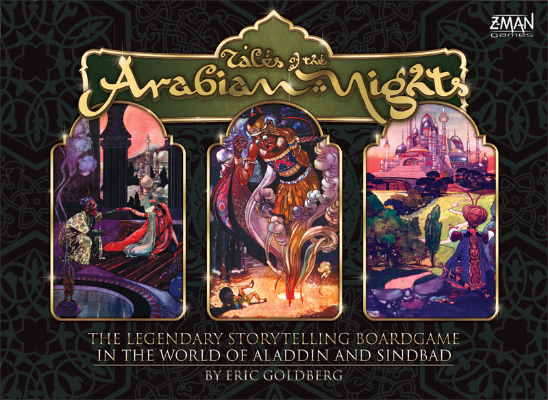
Box cover
[click image to enlarge]
The cover features three illustrations from the original 1912 edition of Arabian Nights illustrated by the wonderful artist René Bull.
Since my first preview, I’ve done more work on the cards and improved them somewhat. The card front design has been simplified a bit, and the type of card is now shown on it. These types may yet be differentiated more, probably by colour.
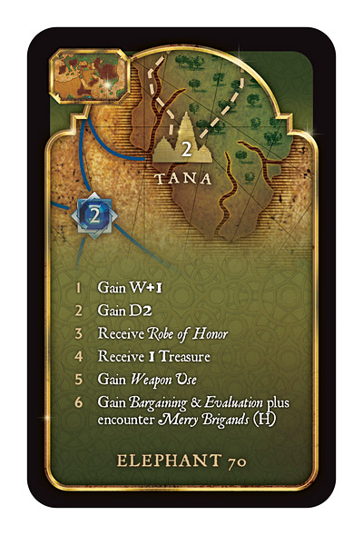
This sample city card shows how players can easily find the location of a city both by a thumbnail image of the board and an image of the city and surrounding area.
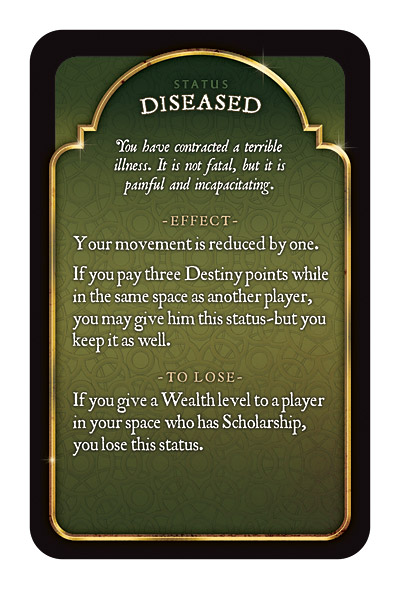
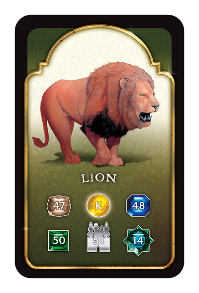
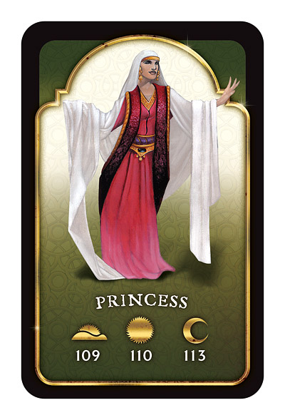
This status card gives you a sample of the many wonderful and horrible things that can happen to adventuring characters. And of course there are many creatures and people to encounter in the world of the Arabian Nights: for example, this card and this card–not to mention the 3,000 or so paragraphs in the Book of Tales!
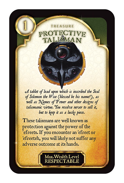
Fortunately, there are many wonderous treasures to be found as rewards for the brave and lucky–here’s just one of the many. All the encounter and treasure cards are illustrated by the talented Dan Harding.
And finally, a look at the entire board, close to final approval. Hope you like it, even if the sea isn’t blue. Note that I was careful to put the numbers for the score tracks outside the actual spaces!
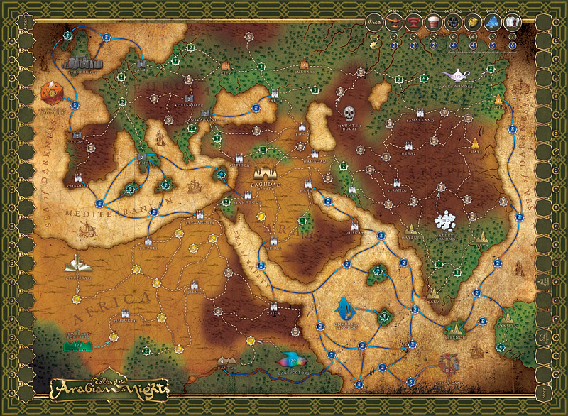
Board
[click image to enlarge]
Hopefuly you’ll all grab a copy of this great game when it’s released–I know I’m looking forward to playing …
Jul 17, 2008 @ 19:31:45
You’re such a geek Pete. But thanks for the copy of Assassin’s Creed. I’ll let you know what I think when i get a spare minute to play…
Jul 17, 2008 @ 20:25:27
Everything is shaping up to a beautiful game. And I mean it, it’s really beautiful.
One… “complaint” though (a minor one): Yeah, the sea. I never thought it could be blue, but I always look at it first, thinking it might be the land, just because it is brighter. Are you sure you don’t want to swap the colors between land and sea?
Jul 18, 2008 @ 01:06:52
If I may? *ahem* DUUUUUUDE!
Looks great. I will definitely pick up a copy. How does this compare to a game like Arkham Horror in terms of space and time required to play?
Jul 18, 2008 @ 02:51:59
Looks great! I’m especially happy that they’re going with that version of the box art. Can’t wait to get my copy.
Jul 18, 2008 @ 03:11:48
If I had any uncertainties about buying the game, these latest pictures have resolved them. Even if I never play the game, I will derive enjoyment from just leaving it set up on the table of my hookah dome. Beautiful work.
(I share other commenters’ concerns about the figure/ground ambiguity in the map. But this could be a boon: it opens the door to a rule variant where you play in the alternate history of Vladstudio’s Inverse Earth, trekking across the long isthmus between the Indian Kingdom and the Mediterranean lands, or sailing the Arabian Sea.)
Jul 18, 2008 @ 11:54:33
This game looks beautiful and interesting. Hope it comes to America soon- count me in for a copy!
Jul 18, 2008 @ 13:52:34
OK, I’d already decided to purchase this… and now you put it into the Agricola/Gathering Storm “want” category. Darn you, graphics wizard… darn you & your seductive kind, tempting me to buy more games!
Jul 18, 2008 @ 13:54:01
Mwwha haaa ha ahaaa haaaa!!!!
Jul 19, 2008 @ 04:35:09
Wow… those are gorgeous!
Jul 19, 2008 @ 04:47:18
really nice, but please change the color of the water!!!
Jul 19, 2008 @ 07:48:06
Very nice work, really look forward to the finished game.
Robert
Jul 19, 2008 @ 09:34:52
It is looking good.
However, I do not see the differentiation on the map from the Non-wild area around Baghdad. Usually there is a lighter color area outside of which you add 2 to your die roll for the encounter. Is that not being done anymore? If it is, this really needs to be more distinguishable.
Jul 19, 2008 @ 12:19:45
mondo: If you’re not joking, please go here.
Sterling Babcock: Each city has a number on it which you add to your die roll. The civilised areas have no number on the cities. Easier and clearer than a lightened area on the map.
Jul 23, 2008 @ 16:59:59
Um, I’m really sorry, but I like the blue sea too.
Jul 23, 2008 @ 17:22:57
Yes, that would look great if you were going for the ‘hit me over the head with a technicolour hammer’ look. Pil, you traitor!
Jul 25, 2008 @ 01:58:01
I also like the map with the blue sea. At first glance I can easily recognize that part of the map is a sea… not a desert. I feel if you are going to color the map with green, might as well color the sea blue. But if you go for the parchment look which is sorta brown/khaki then make everything (map background) in that shade. It’s just my own preference sorry.
Jul 31, 2008 @ 08:50:29
I’m trying to add some feedback here as someone who’s actually played it, so I hope you find it useful.
One, are the tracks on the left and right (I assume those are for story and destiny points) not too small to provide for marking five players?
Two, do you really want the optional-rule trade track on top? It breaks the “flow” of the map for me entirely, as does the huge logo on the bottom left. Adding a compass rose would make it even busier.
The sea connections look kind of weird on this resolution – are they really pink/blue? And I feel the “special” locations (like the Haunted House and the Lake of Colors) look kind of too modern/colorful for the old-style map feel you’re going for.
I sincerely hope I’m not overwhelming/insulting you here. As you’ve said, it comes down to preference, but maybe there’s something in here that you find interesting or enlightening.
Jul 31, 2008 @ 09:48:18
Thanks for your feedback. To address your points:
The tracks are big enough for the counters provided. Should 5 players all have the number of points at the same time, they will of course have to stack their markers!
That’s the Wealth/Movement track up top. Sorry you feel this and the logo break the ‘flow’ of the map, but the info has to appear on the map and there’s limited space.
The sea connections are blue/light blue, so I’m a bit worried about your screen calibration!
The special locations match the style of the cities – icons in various metallic and other textures. These are in contrast to the old style map – I’m not slavishly copying that format by the way, this is supposed to be something new that is influenced by several styles. I would love to have elaborate detailed illustrations for all cities and locations but time, budget and (personal) skill do not allow, so I liked this solution.
Bu that’s all a matter of aesthetic preference.
Cheers!
Jul 31, 2008 @ 19:22:10
Oh, that’s the wealth track? I guess that makes a lot more sense — I’d thought it was the trading connectors. I guess it’s too late along in the process to reduce it a little in size, but I guess I have no actual idea how large the map is, so maybe it’s not as distracting in real life.
As for the screen calibration, it’s even harder to make out details at 1920×1080 🙂
I’ll trust your judgment (big fan of your Nobilis and Omega Stone designs, it has to be said) and I will definitely be giving both this and Prophecy a look at Essen in October!