Cat holic Tastes (Sorry)
28 May 08
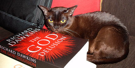
Drusilla curls up with a good book.

23 May 08
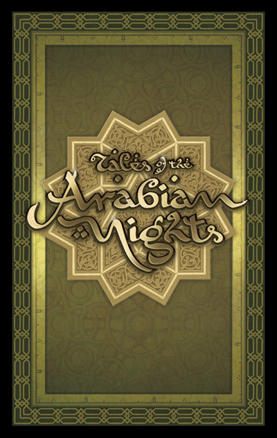
Card front and logo
[click image to enlarge]
My next major boardgame design project has been the remake of the 80’s classic part-boardgame, part-roleplaying game, Tales of the Arabian Nights, by Eric Goldberg, to be published by Z-Man Games. There have been two versions of this game–one in English in 1985, and one in German in 2000.
I pushed to get this job because I thought the rich possibilities of the theme had not yet been explored in gaming graphic design. The Arabian Nights is an unique and exciting melieu, but too often it gets a very Westernised fantasy treatment. One of my personal goals was to create artwork that reflected the exotic nature of the Arabian Nights. So the motifs are sourced from Islamic decoration, embellished with glittering metals and colourful jewels. Another big influence were the wonderful ‘Golden Age’ illustrations of such masters as Arthur Rackham, Edmund Dulac and René Bull.
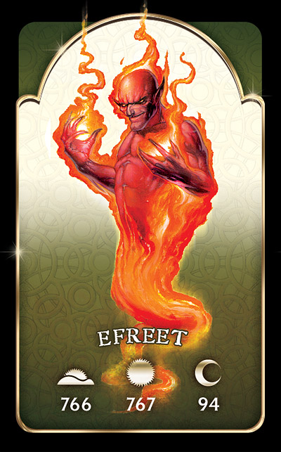
Encounter card
[click image to enlarge]
It was the chapter headings from René Bull’s 1912 edition of the Arabian Nights that inspired the game logo. Using that hand-drawn font as a basis, I reworked the letter forms to arrive at something a bit more readable but still evocative of curvilinear Arabic letterforms.
The mechanic that makes Tales of the Arabian Nights quite different from your usual game is the story–as the players adventure throughout the known world they refer to numbered paragraphs in a Book of Tales that tell an exciting interactive tale–a bit like the old Choose Your Own Adventure books. The players’ reactions to the encounters influence and expand the story.
The game has a wealth of cards, many of which refer to these numbered paragraphs. In the Efreet encounter shown, the paragraph referred to depends on the time of day the encounter occurs, either morning, noon or night (or more prosaically, the further along the game has advanced).
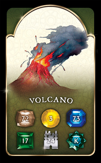
Location encounter card
[click image to enlarge]
On location encounter cards, the paragraph number depends on the terrain in which the encounter takes place. One thing I got rid of from the old editions were the fiddly icons that denoted the different locations on the board. Instead, I used coloured gems (also different shapes to assist colourblind players). These correspond to paragraph numbers on the encounter cards. It’s also immediately obvious which type of terrain the gem is in from the colors and illustrative terrain on the board.
City encounter cards refer to specific cities on the board and feature a picture of the location and a random encounter table. There are also many other cards for various player statuses such as ‘love struck’, ‘pursued’ or ‘under geas’.
The card illustrations were done by the talented Dan Harding, whose bold, evocative work dominates the design. Nice work Dan.
The map, of course, was the main design challenge. In previous incarnations the map was painted in a very conservative fashion–green forests, blue seas etc. This new map, a small detail of which is shown, is heavily influenced by ancient cartography, the fascinating subject of several books I own. Hence the parchment look, the more subtle colouring, and the period-accurate style. Instead of little illustrations I have used silhouettes of buildings that match the architectural styles of the cultures, which contrast nicely with the old map look.
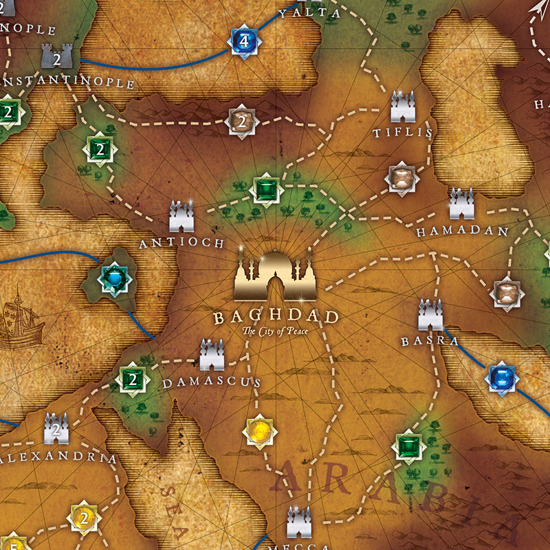
Map detail
[click image to enlarge]
There’s still a bit more work to do on this project–laying out a 256+ page Book of Tales for example–but I’m convinced it will be worth the wait. Because this game is such a storytelling, semi-roleplaying one, the object has been to create designs that transport the players to another world, stimulate their imaginations, and immerse them in the exotic, different world of the Arabian Nights. With the aid of research into old Arabian Nights editions, Islamic decoration and ancient cartography, I hope to achieve that goal.
More previews soon!
14 May 08
Catholics think some aliens may be innocent of the original sin Of course, the Church would still be happy to give ’em war, disease and cultural genocide.
07 May 08
A friend and I were discussing the rings that creatives have to jump through when quoting to corporate clients, when he came up with this analogy I just had to repeat here:
I’m visualising Pope Julius II saying to Michelangelo:
“We want you to paint the ceiling of the Sistine Chapel for us, but we want a fixed-price quote showing your estimate of the level of complexity, scope of work and an allowance for us screwing with your design at any time. Oh, and by the way, if your price doesn’t match our idea of what it’s worth we’ll refuse to pay at all and if you make any trouble we’ll denounce you to the Inquisition and have you burnt at the stake as a heretic. Now go and get your paints, wonderboy.”
05 May 08
Fear not, the kind of hard-edged cynicism you’ve come to expect from Headless Hollow will return soon.
03 May 08
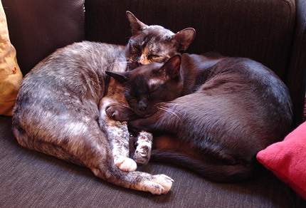
May I introduce to my readers two little additions to our life: Ripley (on the left) and Drusilla (on the right). Just settling in and already hatching evil plans for house domination.
Recent Comments