07 May 13
I’ve been using Adobe software since the very first versions, and I’ve bought just about every single upgrade they’ve released over the life of the company. Throughout my entire working career, some 25 years, I’ve paid Adobe tens of thousands of dollars to use, in essence, three programs: Illustrator, Photoshop and inDesign.
But that’s not enough to satisfy the greed of this company. Now that they have virtually complete control over the graphics software market, Adobe wants to abuse that monopoly by getting access to my wallet every month. And if I continue in my profession and want to continue using their software, they want money from me every month for the rest of my life.
Adobe is stopping development on their Creative Suite and making their ‘Creative Cloud’ the only option for users of their software. No longer will I be able to buy the software, I’ll have to rent it. And as soon as the money tap turns off, I won’t be able to use it anymore, because the software checks in every month to see that I’m still paying.
This has got to stop!
I remember when Adobe stopped providing a manual with their product; replacing it first with PDF documents, and finally with an online mish-mash of user videos and badly designed Help pages. I remember being amazed that I was till paying the same amount to upgrade, but the physical manual had been taken away, and what a huge amount of money the company had just made for itself by doing so. But imagine the cash Adobe will be raking in now—no more physical product, no physical distribution, no local support, reduced piracy (piracy, I might add, that often leads to later purchasing)—just lots and lots of lovely regular cash from everyone’s Visa cards, in return for a lot of useless twiddling and bloated ‘features’ that you use in real-world situations about 0.2% of the time.
Because every design professional knows that Adobe upgrades—even the more regular ones we’ll supposedly be getting now version numbers will be done away with—are 90% useless bloat. I’ve been here since version one, and I know how fundamentally different the programs are now from the initlal releases. Strip out all the bells and whistles and you’re pretty much left with multiple redo, the history palette, and layers as the only game-changing improvements over all those years. These programs still quit and freeze, and the interfaces are a primitive, outdated mess.
But the bottom line is, we cannot live in a world where companies have a hotline to our wallets. If this business model continues we’ll all be paying out huge sums of money every month, locked in to vendors churning out mindless marketing spin as they increase their monthly kickback in return for nothing.
Adobe don’t want to give us quality software at a reasonable price; they want to be the next Facebook. It’s essential that we let Adobe know now that this forced subscription model is completely unnacceptable. Don’t sign up to the Creative Cloud. Let CS6 become the last version we use if necessary, and hope that some company has the foresight to take on Adobe and beat it at its own game. As soon as that alterative is available, it will have a ready-made audience of millions of disaffected and exploited Adobe users eager to switch.
Don’t sign up to the ‘Creative Cloud’. Let Adobe know we won’t put up with this abuse.
Update: Make your voice be heard—sign the petition!
Design Adobe
04 Dec 12
 My most recent boardgame graphic design job has hit the shelves: Aztlán by Italian publisher Ares Games (BoardgameGeek link). Like my last project of this type, Ninjato, I was lucky enough to be asked to work with evocative images by illustrator Drew Baker.
It was also a pleasure working closely with Roberto Di Meglio, one of the designers of an all-time favourite game of mine, War of the Ring, and a director of Ares Games.
On this job my responsibilities were to design and create the print ready art for the game box (including the logo of course), the rulebook, the board, and various sets of cards. A lot of the heavy lifting had already been done by the illustrator, and I consciously chose not to detract from the illustrator’s work with too much in the way of fiddly extra graphics, so the challenge was to bring everything together into a unified design package.
The starting point is always the logo. The game is based on the mythological land of the Aztecs, so I went for a monolithic feel, enhanced by some photographic stone textures of Mayan ruins I had taken many years ago during a trip to Mexico. I wanted something bold and readable and reflective of the shapes of Aztec ziggurats, and the typeface Recovery worked well as the basis for the logotype—strong and evocative, yet with a contemporary edge. My only ‘design indulgence’ was the placement of the accent over the A, which cuts into the letter below it.
For the board, I added the logo and scoring track in the same style as the illustration, plus the icons for different terrain types, among other things. The icons were modified from an initial set done by an Ares Games designer, which I added to, changed and recreated and then made them look carved from various materials used by the Aztecs—jade, silver, copper and gold. The card designs featured these icons, more stone textures, and the typeface Paralucent Text, which gave me the distinctive yet very readable look that felt right. Again, I tried to keep these cards as free of extra text and unnecessary clutter as possible and simply feature the stunning art, and I think this design sensibility carries across the entire game nicely.

A big project was the rulebook, which is full of detailed examples of play and took quite a bit of work. This involved elements of Drew’s illustrations, with some textural modifications of my own (note, for example, the different types of ‘splatters’ that help deep-etch the illustrated characters in interesting and dynamic ways). As usual, the design was carefully examined over and over and repeatedly tweaked so the layout read as well as possible.
Aztlán is available online or at your usual games retailer now. It’s an elegant and clever design by Leo Colovini (Cartagena, Clans, Inkognito, Atlantis) with some fascinating twists—I particularly like the way the victor in a battle can choose to conquer his enemy or peacefully coexist with him (to receive a ‘prosperity card’ in return). Ares Games have done a wonderful job on the production, particularly with the plastic box insert, the colourful plastic tribe pawns and the ingenious score markers, which stack together into a ziggarat when you go above 100 points.
I really enjoyed working on this one and hope you enjoy playing it!
PS Of course, you can find a rules summary for the game here.
Board & Miniatures Games, Design
09 Dec 08

Way back in 2005, I started chatting with the very talented Denny Unger of WorldWorks Games about his line of beautiful paper terrain sets. There are a few companies making these now, but Denny was one of the first and is without any doubt the best. The amount of work and care and attention to detail that he and his team put into creating paper scenery for games is astounding, and it’s a source of continual amazement to me that a large games company has not yet seen the potential for exploiting his company and snapped it up.
Anyway, I got excited about making game scenery and started on what seemed a simple ‘first’ set—a fantasy building that could be both a themed ‘wizard’s supply shop’ and a generic building. Little did I know how much work would be involved! Several years and hundreds of hours later, it has finally been released for purchase—ladies and gentlemen, may I present Thoumont’s Rare Tomes and Components.
It may not look too ambitious, but you’d be amazed how much work goes into something like this; one of the reasons I’m so in awe of the work that Denny and his team regularly churns out. Just try creating one side of a detailed bookcase and see how long it takes!
Eventually, other things (like my design business) took up too much of my time and it looked like Thoumont’s would never get off my hard drive. Thankfully, Bob Cooper of WorldWorks stepped in, added the finishing touches, and created the instructions documents; and Thoumont’s has finally, after a lengthy and painful labour, come into the world.
If you play fantasy games with miniatures, go check it out. I hope you’ll find it interesting enough to purchase. And while you’re there, be sure to browse through the incredible products that WorldWorks have created, including their print-and-play spaceship combat game, Wormhole.
Design Thoumonts
07 Mar 08
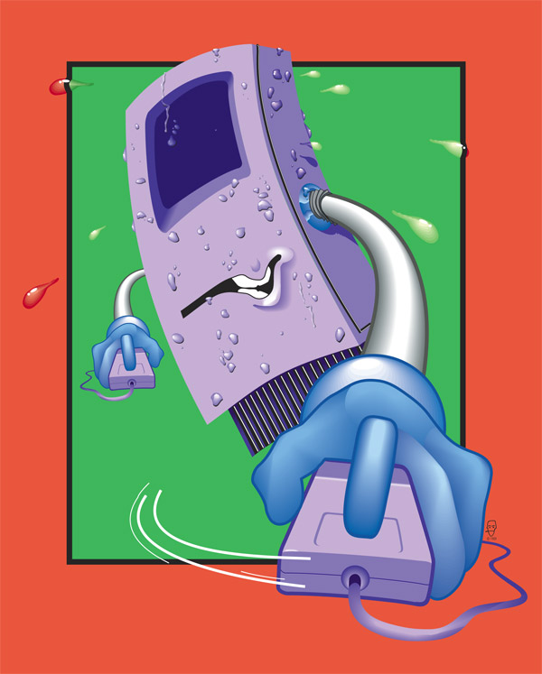
Sweating Mac
[click image to enlarge]
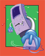
My company, Universal Head, is 14 years old today. In commemoration of this event I looked through my archives to dig out a really old design.
This is the ‘Sweating Mac’, an illustration I did way back in 1989, and one of the first illustrations I did just after learning how to use Adobe Illustrator 88 (as it was called back then). As primitive as it looks today, this got me a lecture spot on a big Desktop Publishing Conference at the time, which was pretty exciting for a designer fresh out of college. Not many people were doing illustration work with computers yet, so this was pretty revolutionary stuff.
Here’s to the next 14 years! If you’re interested, the Universal Head site is here.
Design
15 Jul 07
Get the Glass! One of the most beautiful Flash promotional games I’ve ever seen.
Design
11 May 07
Corporate Ipsum Dashboard Widget: I often get text almost as bad as this from clients.
Design
06 Apr 06
I’ve got nothing against business wanting to do business. We live in a capitalist society after all. But some businesses seem to think that any method of deception is justifiable in their quest for profit. And to me, this kind of thing is pretty much on the same level as the endless spam emails that fill your Inbox every day trying to convice you that a patch will make your penis bigger.
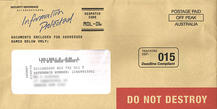
Take for example, the letter I received yesterday, shown above, from our friends at Reader’s Digest. You’d be forgiven for thinking that this was actually an important document of some kind, covered as it is with a despatch code, a ‘deadline compliant’ tracking reference number, a security reference number; not to mention the big red bar with DO NOT DESTROY on it, and the official-looking brown paper the envelope is made of. There’s even a printed ‘hand-written’ touch—‘information protected’.
What does all this mean? I’m special! It’s for me, and me only! If you tear open this tissue of lies the crap continues inside— the letter repeats the ‘deadline compliant’ graphic, but this time to look like a green sticker; the endless reference numbers continue, the letter is personalised throughout. Someone didn’t return their Sweepstakes entry—and that mistake cost them $50,000! I’ve passed two of the three stages necessary to win up to FIVE HUNDRED THOUSAND DOLLARS! There are lots of CAPITALS and bolded words! My neighbours—apparently—are looking in their letterboxes in vain!
Deception, outright lies, pre-meditated, cold-hearted fakery. Everything about this piece of communication and design is intended to fool the recipient, whether they be someone who can immediately spot the deception a mile off and immediately throw it in the recycling bin where it belongs, or a geriatric pensioner with no money to spare living with the false belief that Reader’s Digest is still an organisation of integrity.
If they came to me to design this letter—I’d tell them to bugger off.
Design grumpy
17 Jan 06
January is a-wastin’, but happy new year to you all out there. I’ve been putting off my first entry of the year as I wanted to start with a bang—I’ve finally got around to totally revamping my design business website: Universal Head. If you’re at all interested in graphic design, I do invite you to go and have a look around.
I’ve been in business for myself for nigh on twelve years now, and it was high time I made a site as clear and easy to use as this one. My last one was good for its time, but it relied too heavily on the bells and whistles of Flash animation. So for a while now I’ve been a little embarrassed to preach to my clients about ‘fast-loading’ and ‘easy-to-navigate’ and ‘standards-compatible’ websites, and then direct them to a business site that was anything but. That’s all been fixed. And I must admit, now that I get all of that work out in such a coherent format, I’m quite chuffed with the variety and quality of work on display (and this is only a small selection of many, many jobs over more than the past decade).
The object of this site is to present some of the best of that body of work in a clear, fast and easy to navigate format, and I think I’ve succeeded.
So anyway, let’s kick off this 2006 business shall we?
Design
06 Oct 05
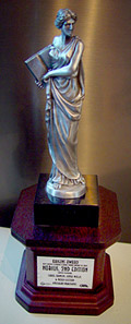 Well, I won it three years ago—I only just received it! Back in 2001 I was in London and doing a bit of work for various companies there, one of whom was a game publisher called Hogshead Publishing, who at the time were putting out, among other things, the excellent Warhammer Fantasy Roleplay. I worked on the logo and cover layout of one of the WFRP tomes, Realms of Sorcery, and also designed the cover of a bizarre roleplaying game called Nobilis. It so happened that at the next Origins Awards, ‘the industry’s premier awards for recognizing excellence in hobby games publishing’, Nobilis won ‘Best Graphic Design of a Book Format Product of 2002’, an accolade I share with James Wallis and Carol Johnson, who did the book’s interior.
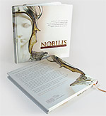 If you’ve ever seen a bunch of gaming products on the shelf you’ll notice that they all tend to fall into the ‘bright colours, monsters and buxom warrior women’ kind of mould, but James, who owned Hogshead (and did most of the work) had the courage to do something different with this product. We’d sit in the pub next to his office and discuss his ideas for it over a few pints. Instead of battling beasties, he wanted to use the stark image of the Art Nouveau sculpture Sphinx Mysterieux by Charles van der Stappe.
 The job was a graphic designers dream—given such excellent source material, my instant solution was to feature it large and closely cropped with a simple yet elegant logo treatment. The image wraps over the covers and the bust’s pupil forms the ‘o’ of Nobilis on the spine. I had the pleasure of designing for a large format square hardcover, unusual in publishing. Inside, James did a beautiful job with the layout, with full page, surreal B&W illustrations and a perfectionist’s eye for detail. Everything about the book made it stand out from the usual gaming fare (including the content, I might add).
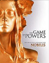
I continued the concept with the follow up, The Game of Powers. They’re jobs I’m still proud of—every review of Nobilis I’ve read praises the design. So it’s nice to have this surprisingly solid and well-made award sitting on my desk three years on. Not only does it remind me of a job well done, but it takes me back to London, 2001, and the wonderful people I met there.
Design
23 Jun 05

If you’ll permit me a bit of shameless self-promotion, let me present the latest site rolled out by Universal Head, my design company. Since I still haven’t had the time to redo and update my company site—it’s long overdue for the full CSS treatment—I might as well give new work a plug here.
Company dee is a corporate communications, event management and documentary production company. Universal Head designed (taking cues from the company’s existing corporate identity) and coded the site.
Design
« Older Entries

Recent Comments