
Boardgame Design: Traders of Carthage
Feb 16
Board & Miniatures Games Traders of Carthage 12 Comments
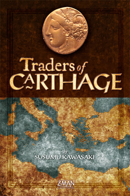
Box cover
[click image to enlarge]
Some of my visitors may have realised by now I like to play the odd boardgame, and I’ve had the opportunity to do a bit of boardgame design here and there too. While I do the occasional print job, a lot of my professional design these days is web-based, so it’s satisfying to create something ‘real’ for a change–especially something that people will play and enjoy now and in the future.
The artwork for a small game called Traders of Carthage just went off to the printers, and I’m looking forward to its release as it’s the first game for which I’ve designed all of the graphics from scratch. ToC is by Susumu Kawasaki and will be published by Z-Man Games. Here’s a sneak peek at some of the graphics.
The most interesting thing about boardgame design is fulfilling two objectives: one, to make the game look good, look interesting and enjoyable to play, and to enhance the game’s theme to make the experience as immersive as possible; and two, to design the game graphics in such a way that the game mechanics work as effectively as possible. The challenge is to succeed in designing something that not only looks good, but works. Hold on, my company motto is ‘Design That Works’…
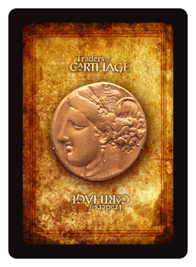
Card back
[click image to enlarge]
Above you can see the box cover design. ToC is a small game, and I wanted to create something rich in texture, precious looking, and something that evoked the ancient period. Above all, a game that I would love to own and be eager to add to my collection. The logo was developed from the fonts Post Antiqua and JSL Ancient. The main motif is an electrum coin from Carthage, a bold symbol that is echoed throughout the game components.
The card backs feature the coin on a rich textured background, with a small logo top and bottom. Though some feel that black borders on cards wear more than white, I prefer the impact of the strong black border, and if the printing quality is good, wear shouldn’t be a problem.
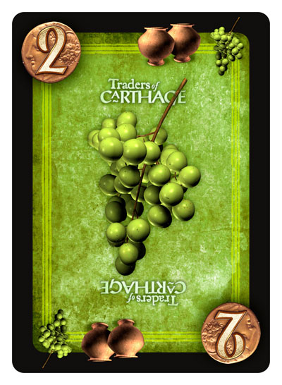
Sample card
[click image to enlarge]
Here’s a sample card: the green ‘wine’ trading card with a value of two (there are four different card types: red/fabric, blue/gems, yellow/wheat and green/wine–each come in values of 2, 3 and 5). Simple 3D work, both my own and developments of commercial models, features on the cards; carefully textured and post-processed in Photoshop to avoid the ‘computer’ look.
Note also the ‘storage’ icons, which are terracotta storage jars. Storage icons enable players to preserve their goods from the depredations of pirates. Despite the detail and texture, the card is designed for clear and quick recognition no matter which way up it rests on the table.
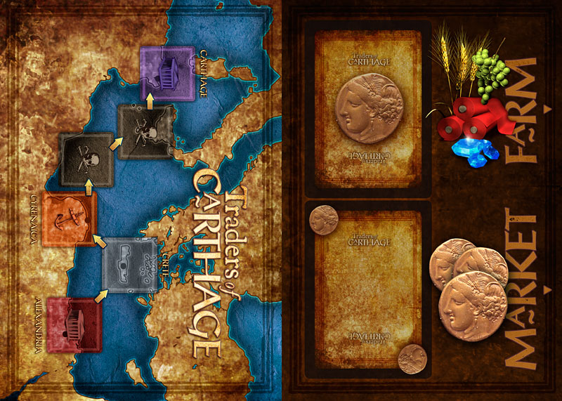
Gameboard
[click image to enlarge]
Apart from some tokens and a detailed twelve page rulebook chock full of examples (for which I indulged myself and bought a lovely, and very appropriate, new serif typeface, Epic by Typetrust), the last element was the small board. On the left side of the board is a bright, colourful map of the Mediterranean featuring the spaces your trading ships travel between Alexandria and Carthage; on the right are spaces for the card and card discard piles, plus indicators for the row of Farm and Market cards that are placed next to the board. The illustrations used on the cards are grouped together to form the Market illustration.
Traders of Carthage reads like a fun little game, and I hope my design makes the experience a little bit more interesting and enjoyable. I’m looking forward to finally playing it! The game is scheduled to be released in the (northern hemisphere’s) Spring.
PS: Acknowledgements to Mike Doyle’s excellent blog, which inspired me to feature some of my game design.
Feb 17, 2008 @ 06:57:05
Looks amazing. Nice work!
Feb 18, 2008 @ 09:59:42
I especially love the stained parchment look of the [back of the?] cards (Specifically, image 2) But, I am a sucker for stained, antiquated graphics. You know that. Nice work, Indy. I mean, P.
Feb 18, 2008 @ 10:07:57
Lovely work. Does the face on that coin look a leeetle bit familiar?
Have your Indy underoos arrived yet?
Feb 18, 2008 @ 11:26:51
“Though some feel that black borders on cards wear more than white, I prefer the impact of the strong black border, and if the printing quality is good, wear shouldn’t be a problem.”
Every graphic artist loves the black canvas. Every production engineer curses the artist when the wear inevitably shows.
Feb 18, 2008 @ 12:20:17
And your proof for that sweeping statement my friend?
There’s no moratorium on solid black from printers as far as I know. As long as you use a proper percentage of inks (ie not the standard excess of inks that Photoshop converts solid RGB black to CMYK black to) and a proper varnish is used, there’s no reason why the black shouldn’t hold as well as any other colour.
The problem lies with computer-trained designers who don’t know anything about the production process, especially the conversion of RGB to CMYK.
By ‘production engineer’ who do you mean, by the way? In my book the designer is involved with and understands the production process; there’s no division. Same reason I code my websites by hand.
Of course I may have to eat my hat when the game comes out, but I’m assuming the cards will be well printed and varnished.
Feb 18, 2008 @ 12:22:56
Pil: Don’t know who’s face it is; some Carthaginian geezer from 250 BCE.
No underoos, but there’s a dead horse I’ve been floggin’ around here somewhere … 😉
Feb 20, 2008 @ 13:15:29
I am gobsmacked! Apostrophe Man delivers a black star to Headless Hollow!!! (and who knows how those edges will wear?)
Feb 20, 2008 @ 13:34:32
God, NOOOOO! Hemisphere’s Spring? Doesn’t that qualify for a possessive apostrophe?
And how about defending me on the black Pil? You’re a print expert!
Feb 20, 2008 @ 13:58:17
I’m so ashamed: ‘whose face it is’.
I’m off to beat myself with a stick of hickory.
Feb 22, 2008 @ 04:32:40
That looks fantastic – added to my want/wishlist. 🙂
Mar 23, 2008 @ 05:18:55
I’m the promoter of Japon Brand.
Thank you very much for redesign our cheap components into this gorgeous version.
I and Mr.Kawasaki(the game designer) are incredible happy to see your excellent works.
I want to play this version as soon as possible!
Tak
Mar 23, 2008 @ 12:40:01
That’s wonderful to hear, I’m very glad you and the designer are pleased with the new look! Thanks for writing!